Case Study
SASA LLP
A sleek, professional website designed to showcase SASA LLP’s services and expertise. Featuring a clean, trustworthy color scheme and responsive design, the site ensures easy navigation and strong brand presence across a...
Visit Live Site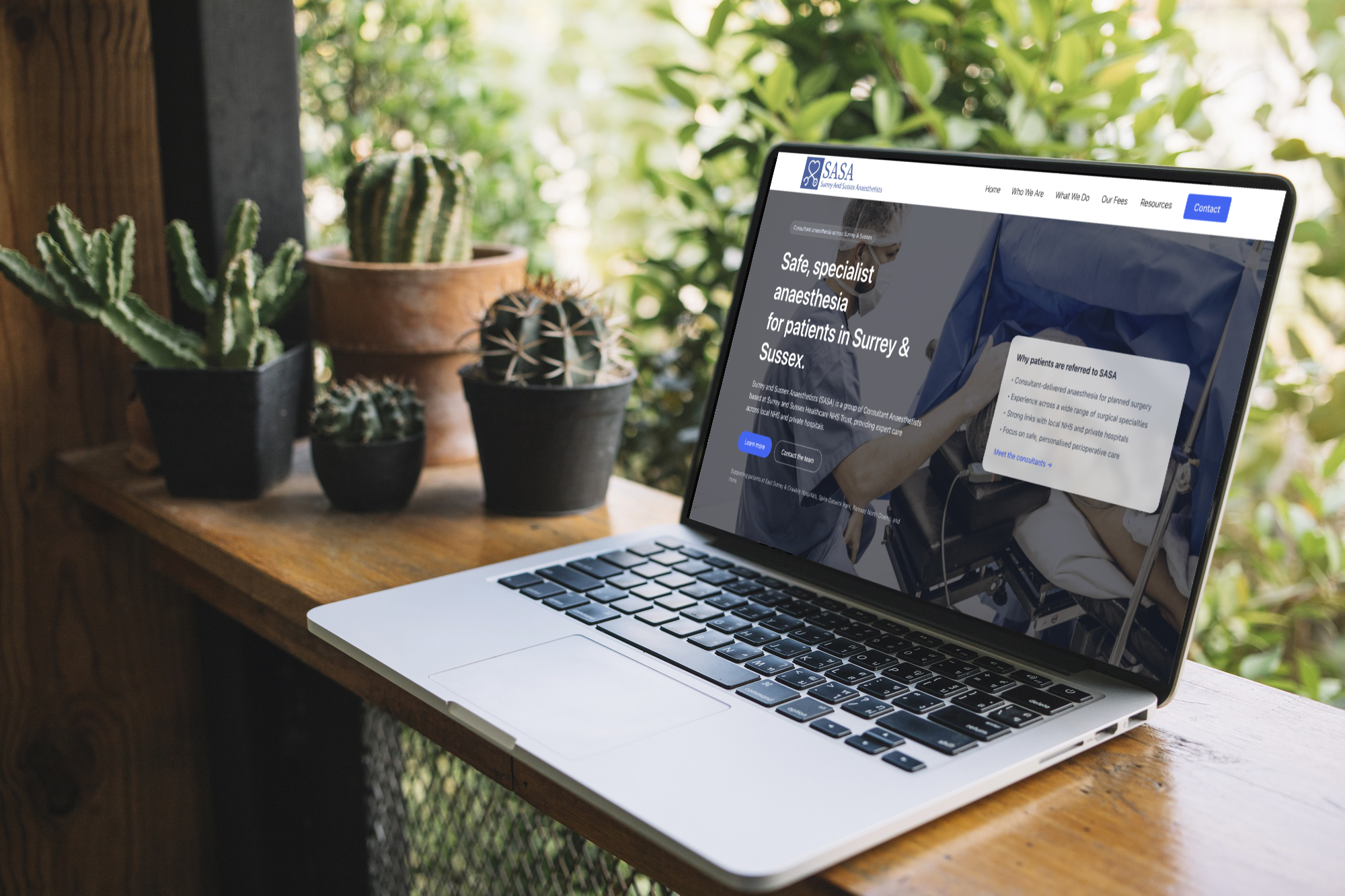

Project Overview
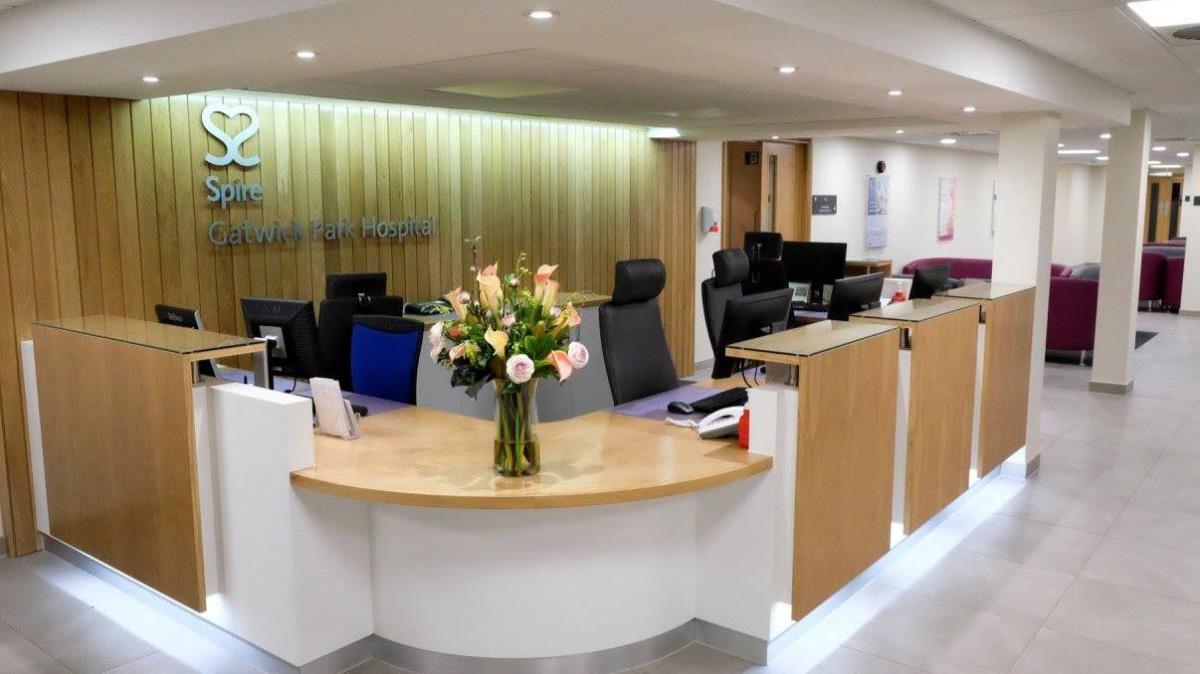
The SASA LLP website project aims to create a modern, professional online presence that reflects the firm’s expertise, reliability, and commitment to client success. Designed with a clean and intuitive user experience, the site showcases SASA LLP’s range of services, key personnel, and industry insights. Utilising a refined colour palette of deep blue, crisp white, and elegant gray, the website balances trustworthiness with approachability. The design prioritises clarity and accessibility, ensuring visitors can easily find essential information and engage with the firm. This project includes responsive layouts optimised for all devices, seamless integration of contact and inquiry forms, and an easy-to-manage content management system, empowering SASA LLP to maintain and update their content effortlessly. Ultimately, the website serves as a strategic tool to strengthen SASA LLP’s brand identity, enhance client engagement, and support ongoing business growth.
About the Brand
The SASA LLP logo uses the strong, confident blue #2e46fa to symbolise the firm’s expertise and dependable nature. Its clean and modern design communicates professionalism and approachability, making a clear statement about SASA LLP’s dedication to excellence and client service. The logo’s minimalist style ensures versatility and timelessness, reinforcing SASA LLP’s image as a forward-thinking yet established firm.

Brand Colours
Why These Colours?
The colour palette for SASA LLP blends a vibrant blue (#2e46fa), symbolising trust, confidence, and professionalism, with crisp white (#fff) to evoke clarity, transparency, and a modern approach. The addition of a neutral grey (#555) adds balance and sophistication, reinforcing the firm’s stability and reliability. Together, these colours create a clean, strong, and approachable visual identity that reflects SASA LLP’s commitment to excellence and trustworthy service.